How to Make a Pie Chart in Google Sheets
A pie chart (or a circle chart) is a graphical representation of data that looks like a circle is divided into sectors each of which represents a proportion of the whole.
You can use Google Docs to design pie charts for free. Google Spreadsheets can be an easy and free graph maker for you allowing you to create a pie chart, a 3D pie chart, a donut chart as well as design your pie charts on iPad:
How to Make a Pie Chart in Google Sheets:
- Format your data:
- Your first column is going to be your chart labels
- Your second column is going to be your chart numbers (each number will correspond to each section size)
- Select the area with your data (Click and hold one cell in the corner and then drag the mouse to select others until the whole area is highlighted)
- In the main menus, click Insert -> Chart
- In the left-hand panel that will appear select “Pie chart” in the drop-down
In the left-hand panel you can select a different column to be used for labels. Furthermore, you can select to use the first row as headers.
How to Make a Pie Chart in Google Sheets on iPad
- Open Google Sheets app on your iPad and start a new document
- Enter your data (here’s how)
- Select the area with your data: Tap and hold one cell in the corner and then drag a blue dot to select the whole chart
- Click + icon in the top-right corner
- Tap “Chart”
- Select “Pie chart” in the right-hand panel that appears and confirm by clicking √ to the left:
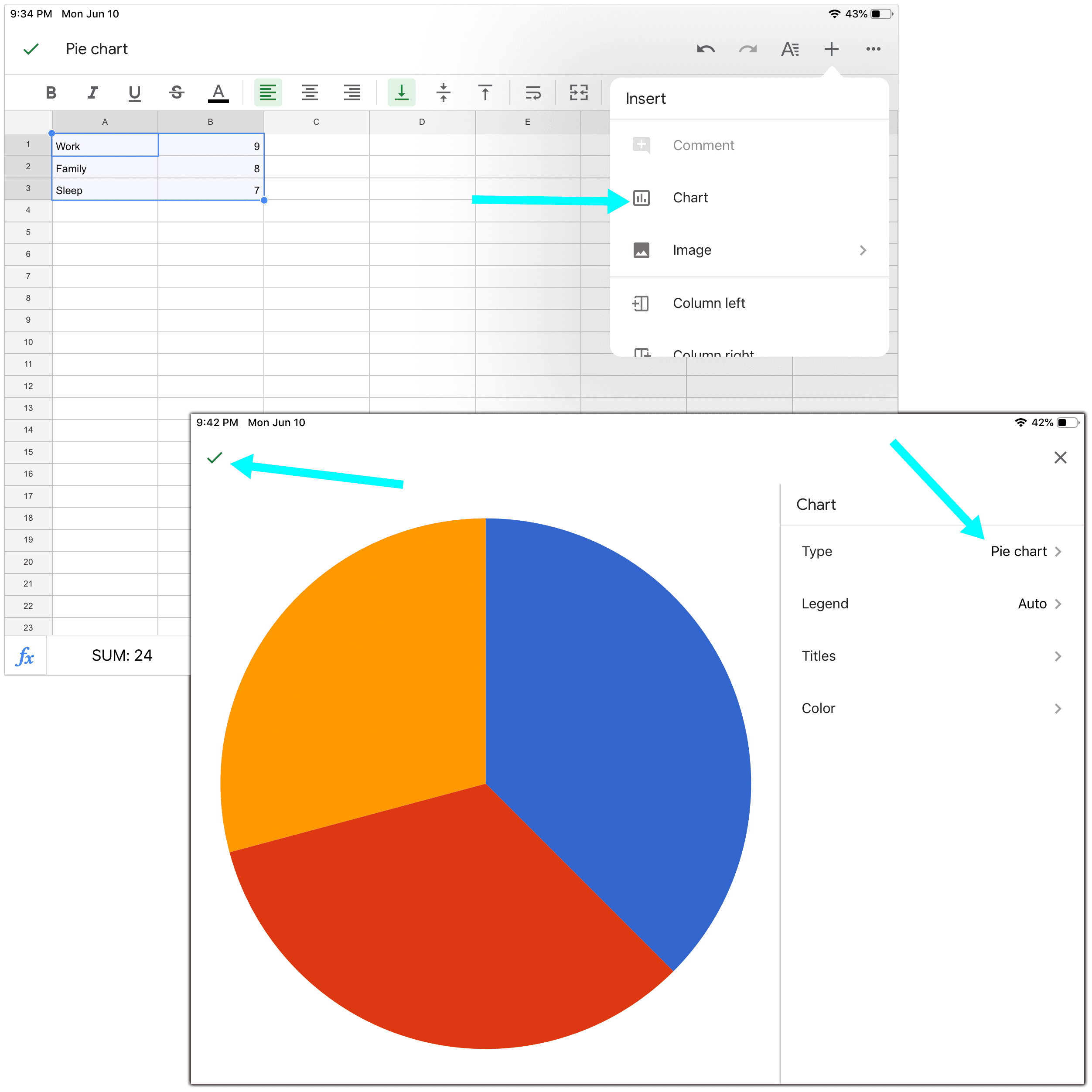
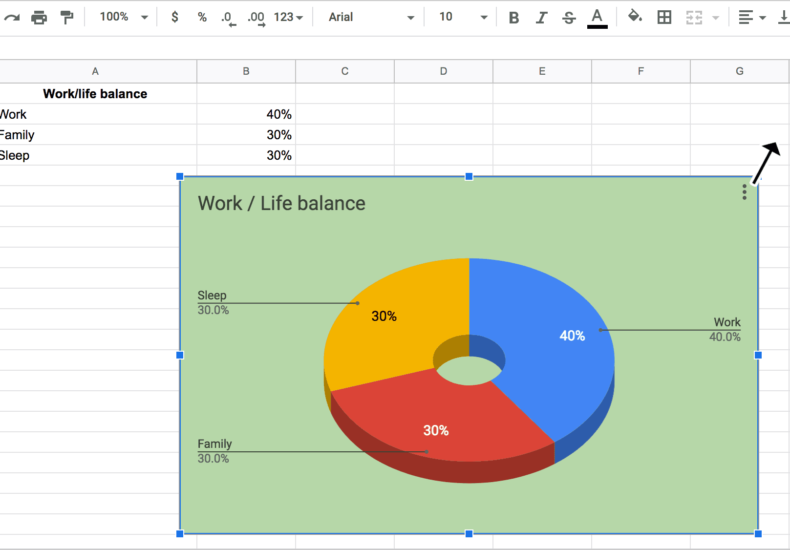
You are done! Your pie chart is created. You can now edit its design, re-position it or resize it.
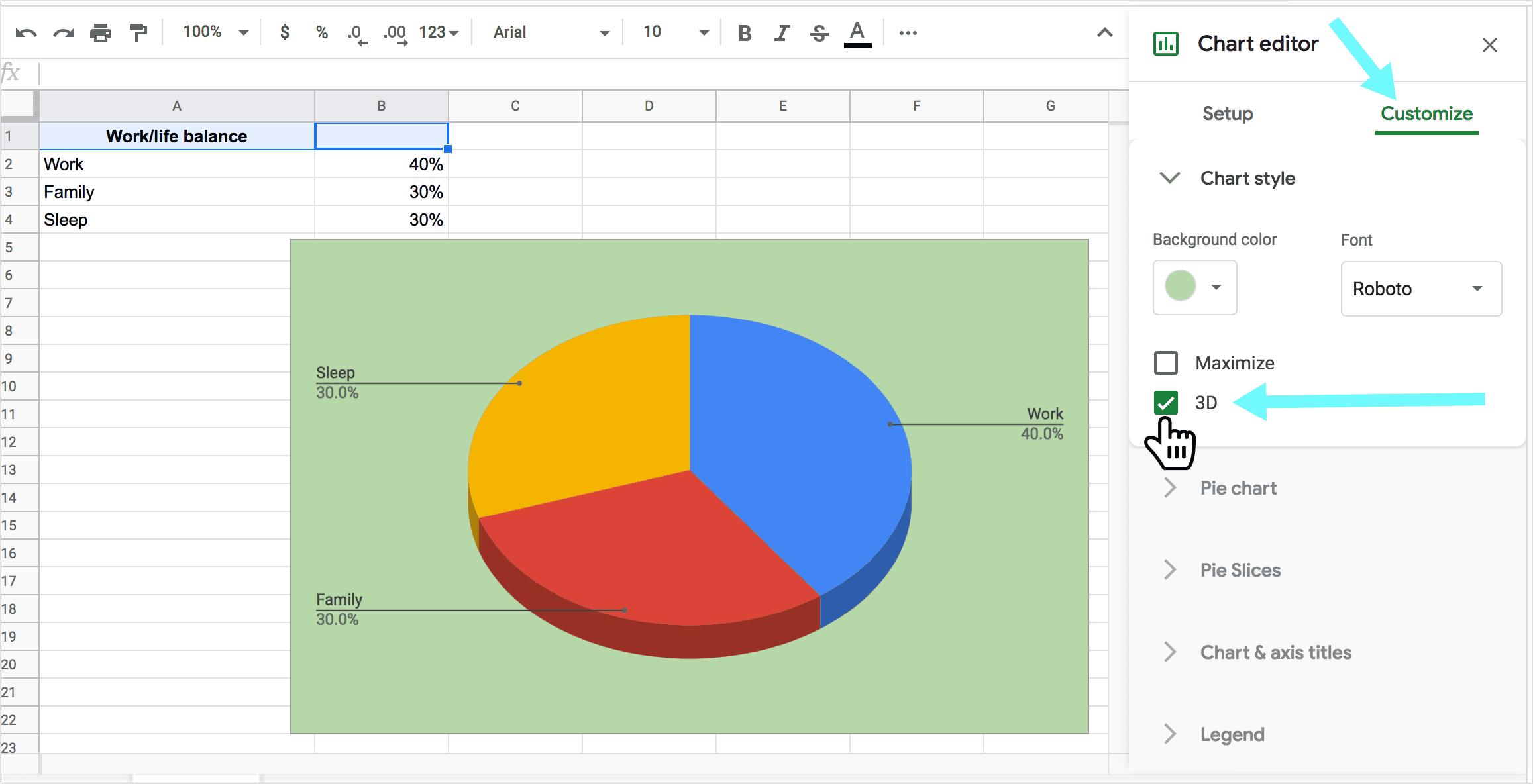
Create a 3D Pie Chart in Google Spreadsheets
- Double-click on a pie chart to select it. You should see a new panel open to the right with the chart options
- Click “Customize” tab inside the panel
- Select “Chart style” and check “3D”
There are more ways to adjust the graph design in Google Docs:
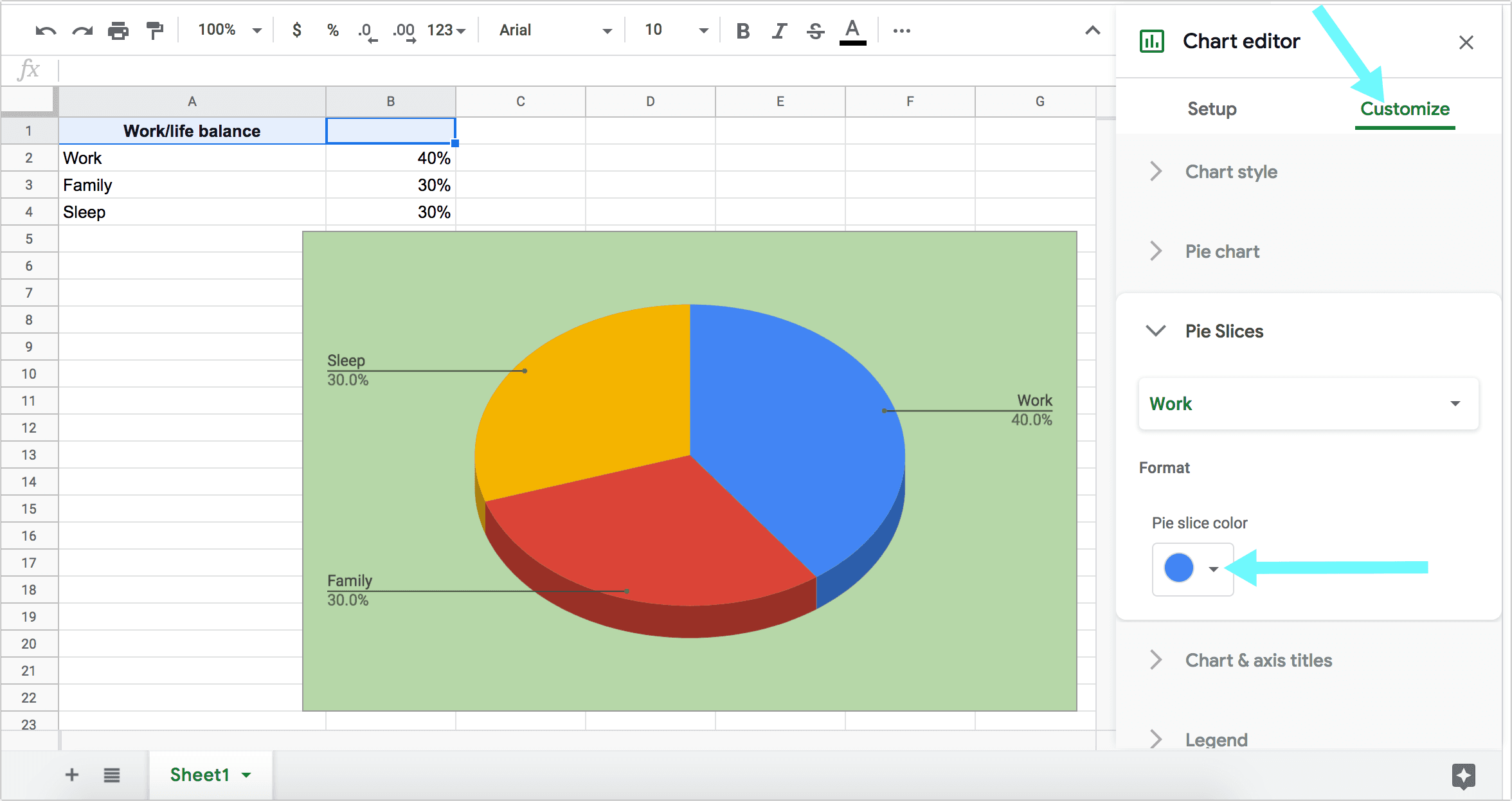
Select Colors for Pie Chart Sections
You can also choose which section is represented by which color by clicking “Pie slices” option:
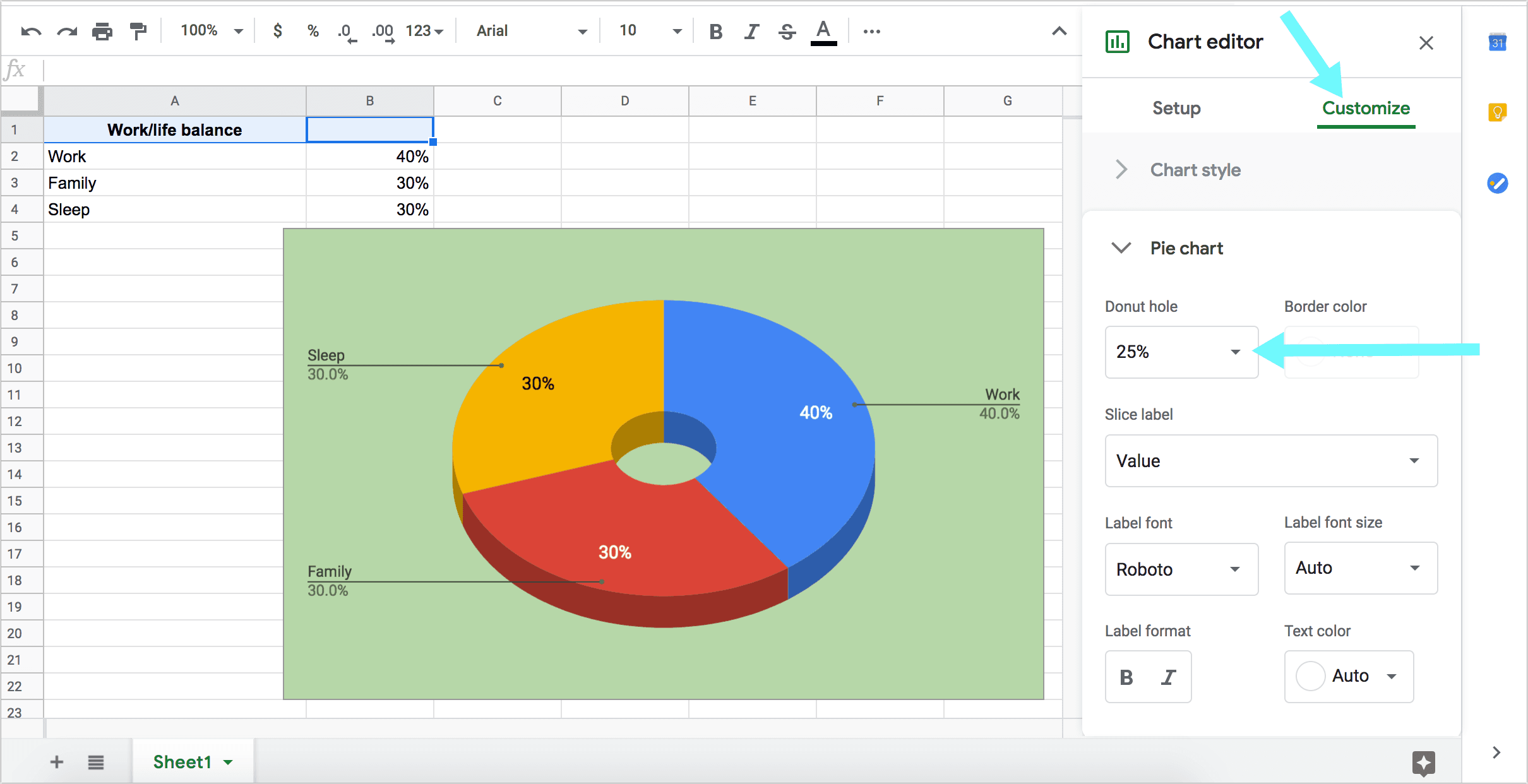
Create a Donut Chart in Google Sheets
A donut chart is a pie chart that has a small circular cutout in the middle, turning the pie into a hollow donut. You can turn a pie graph into a donut chart in Google Spreadsheets:
- Double-click on a pie chart to select it. You should see a new panel open to the right with the chart options
- Click “Customize” tab inside the panel
- Select “Pie chart” and select value below “Donut hole” (The higher the value, the bigger the hole)
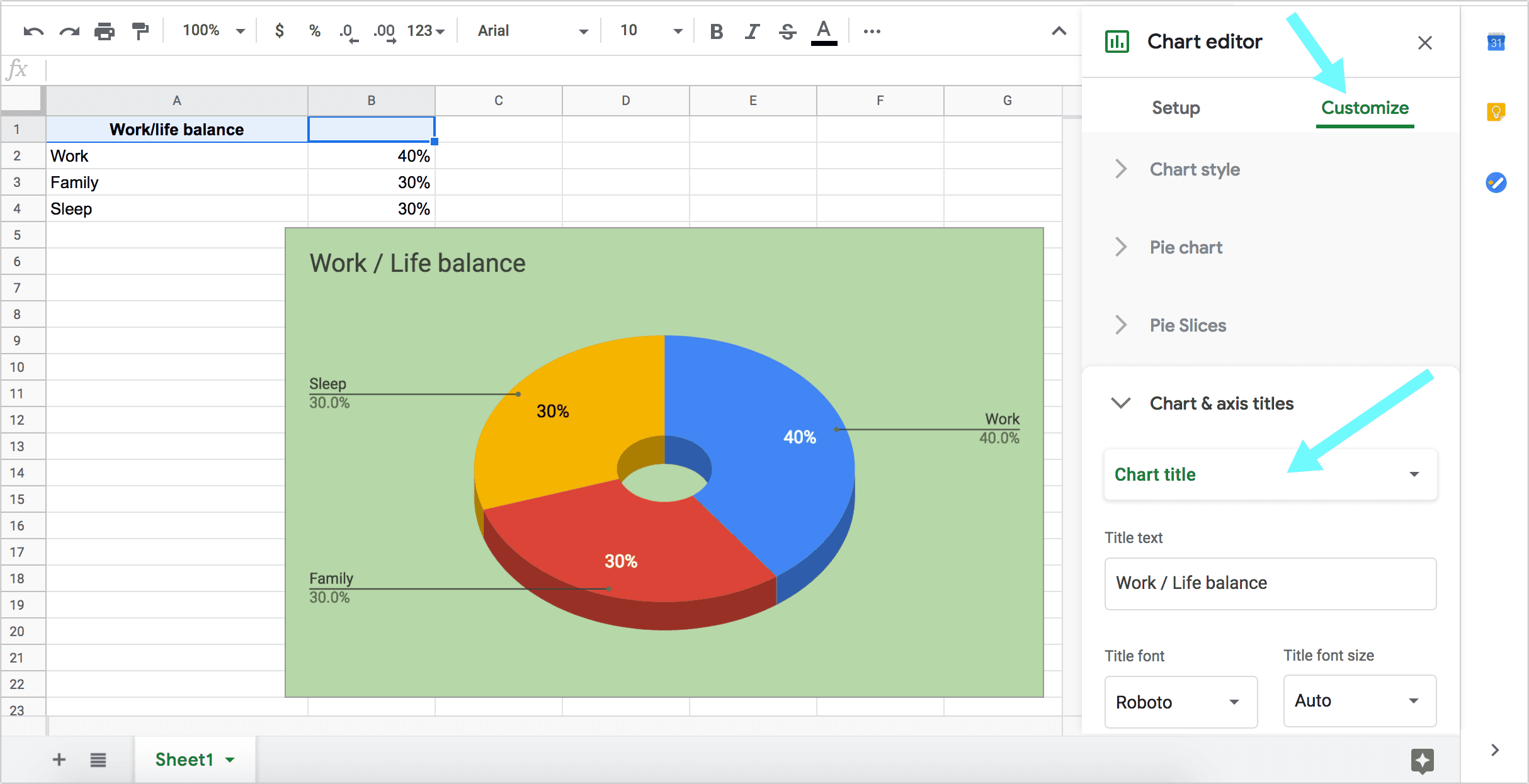
Add the Pie Chart Title
Finally you can create a chart title inside the graph in the Chart & axis titles section:
Make yourself a copy of this spreadsheet to play with the options while you are reading these instructions.
Resize the Chart
You can easily resize the pie chart by clicking on it and dragging the squares along the edges to zoom in or out until you are happy with the size:

To adjust the size on an iPad, tap the pie chart you want to adjust and touch and drag the squares along the edges to adjust its size.
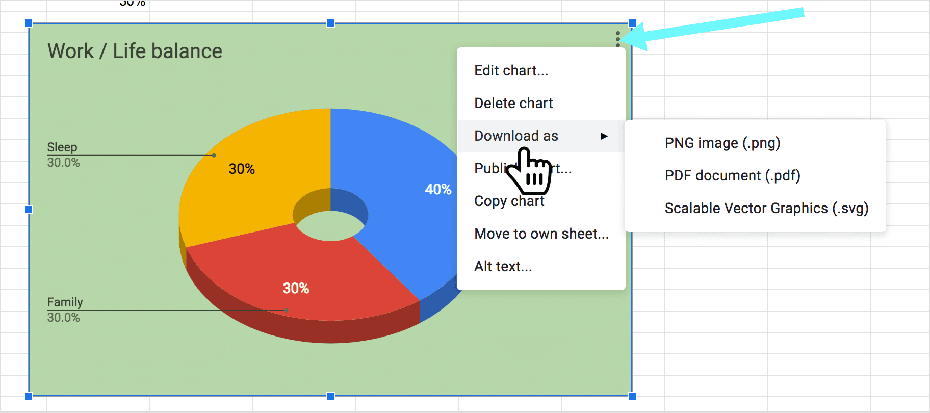
Download the Pie Chart
To download the pie chart:
- Click the pie chart to select it
- Then click three dots to the top-right of the pie chart
- Select “Download” and choose your preferred format:
Publish the Pie Chart
To publish your pie chart from Google Spreadsheets,
- Click the pie chart to select it
- Then click three dots to the top-right of the pie chart
- Select “Publish chart“.
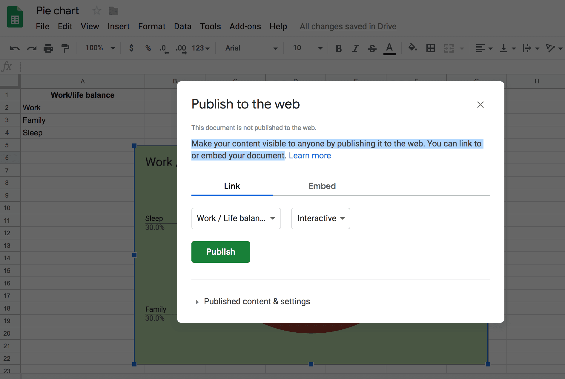
[Make your pie chart visible to anyone by publishing it to the web. You can link to or embed your document]
Here’s what the pie chart looks like when published:
As you can see it’s quite interactive: Hover over any sections to see the actual percentage as tooltips.
There are lots of visualization plugins for WordPress that can help you out!
When to Use Pie Charts for Data Visualization?
Pie charts work great for clearly visualizing percentages and proportional data. They don’t work well for complicated data or large sets of data.
As a rule, it is better to use pie charts when you have no more than 6 categories / sections. More categories will make the pie chart to crowded and hard to understand.
Unlike a bar graph (or a bar graph), pie charts are not able to show changes over time, so they can only be used to visualize the current state of things.
Pie charts work well for illustrating how one category clearly compares to another category.
Overall, charts and graphs are great online research tools that demonstrate numeric data obtained from a survey.
It is best to use contrasting colors to visualize chart sections to make it easier for an eye to clearly see the relative contribution that different categories contribute to the overall total.
Pie charts can be used to visualize:
- Monthly expenses
- Breakdown of votes
- Customer / user preferences (favorite choices)
- Website traffic sources, etc.
To create a nice pie chart, you don’t need any design skills. Google Spreadsheets can be your free and easy chart maker, so it’s probably the easiest way to create data numeric visualizations.